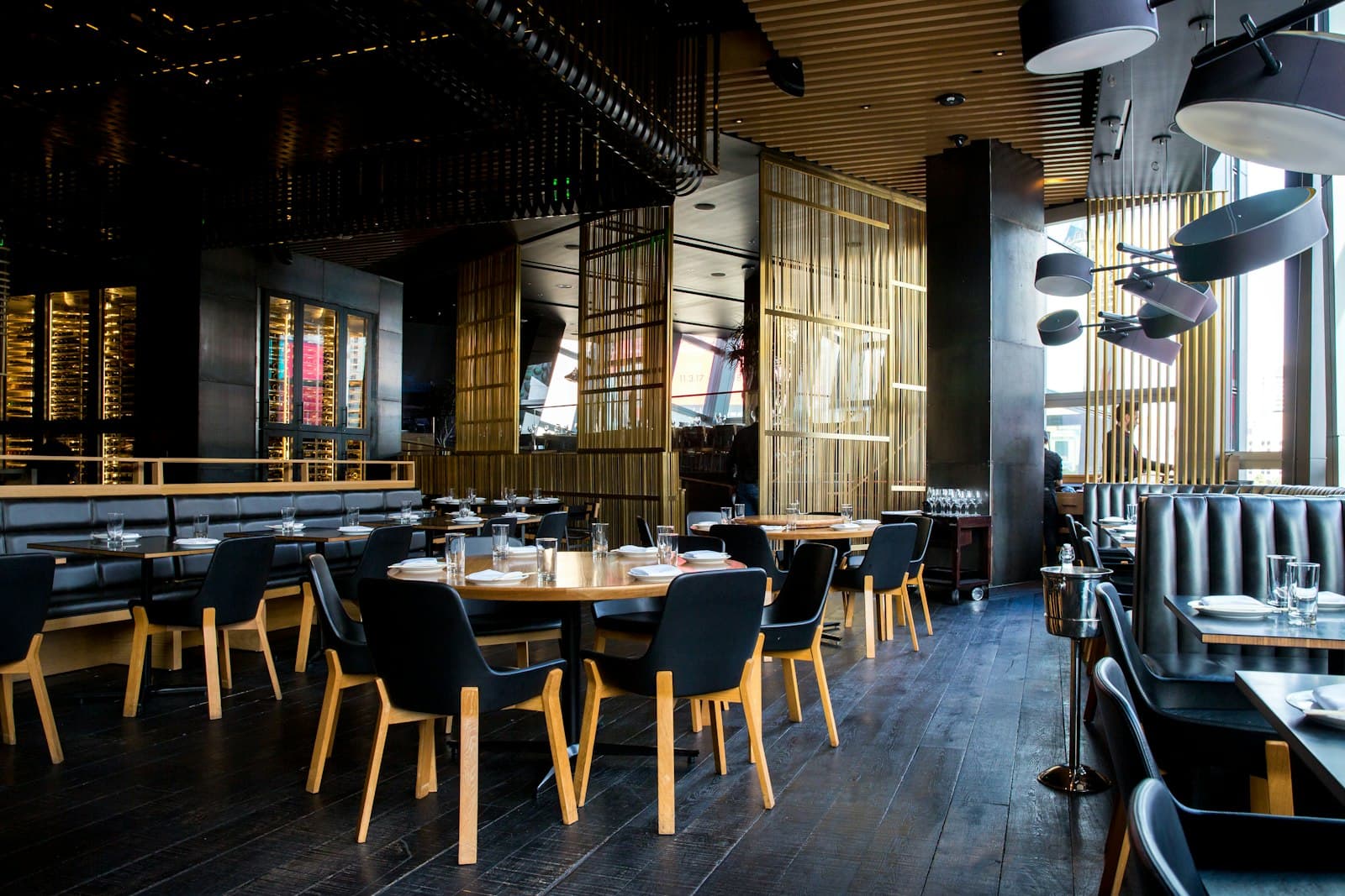
Illustrative example: Cedar & Stone is a fictional restaurant created to show the kind of customer story Menu.ceo will publish. It is not a testimonial from a real customer, and it does not claim measured business results.
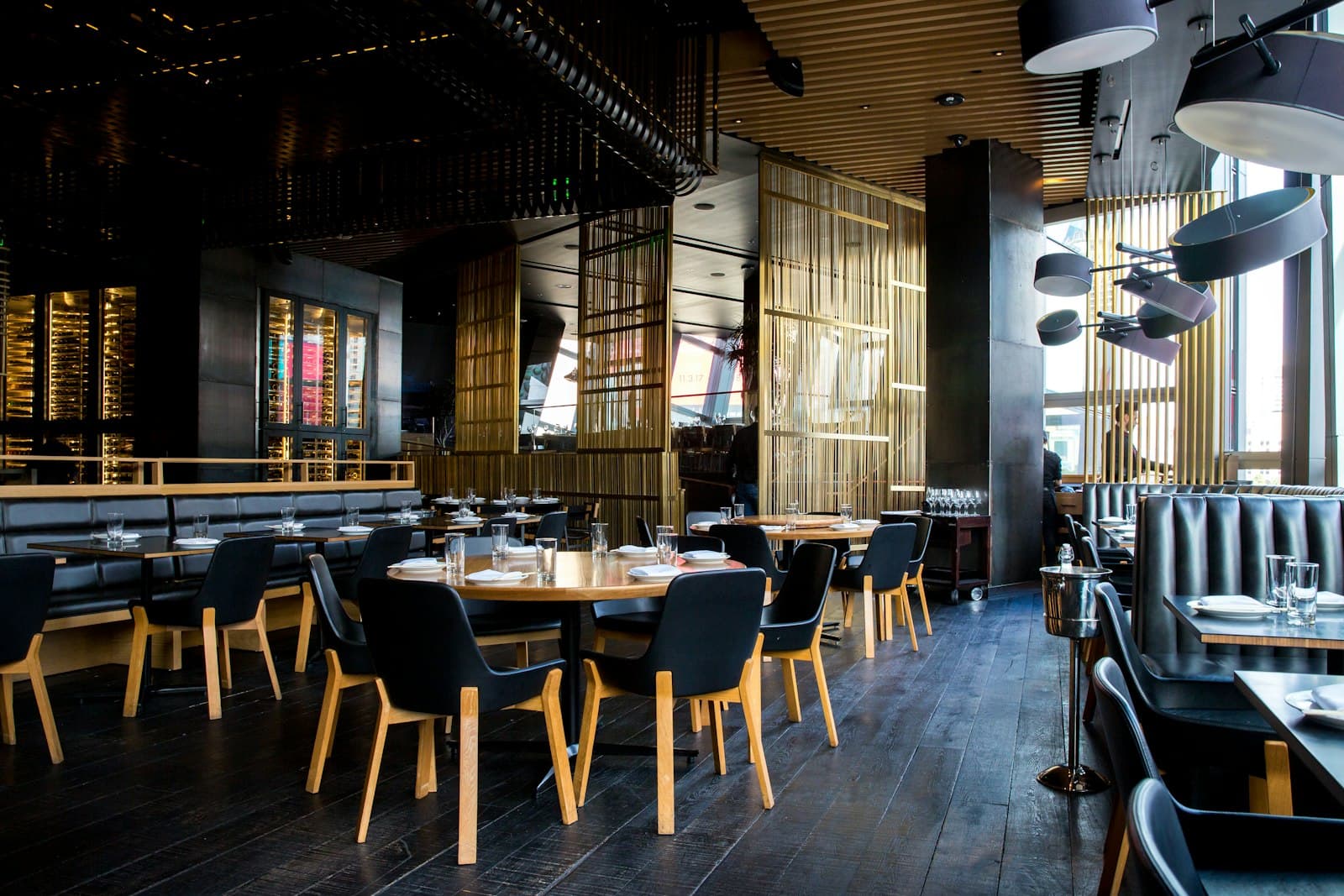
Cedar & Stone is a neighborhood restaurant with a seasonal dinner menu, a shorter lunch menu, and drinks that change throughout the week. The food was carefully presented in the dining room, but the online menu did not offer the same clear experience.
The restaurant
The fictional team behind Cedar & Stone wanted a menu that felt calm, useful, and easy to update. Guests often discovered the restaurant on their phones, then looked for dishes, prices, and dietary details before deciding whether to visit.
The team needed one link that could work across its website, social profiles, text messages, and printed materials.
The challenge
The restaurant's menu lived in several places. A PDF was linked from the website, photos appeared on social media, and small changes had to be repeated by hand.
That created three practical problems:
- Guests had to pinch and zoom on a phone.
- Staff could not update every shared version quickly.
- The team could not easily tell which links brought people to the menu.
The goal was not to add more technology to the dining experience. It was to make the menu easier to find and easier to read.
A simpler publishing workflow
In this example, Cedar & Stone starts by uploading its existing menu images. Menu.ceo organizes the draft so the team can review dish names, descriptions, prices, and categories before publishing.
The restaurant then:
- Checks each imported item.
- Groups dishes into clear lunch, dinner, dessert, and drinks categories.
- Adds concise descriptions and dietary notes where they help.
- Previews the menu on a phone.
- Publishes one memorable link for guests.
The same dashboard becomes the place for future updates, so a seasonal dish only needs to be changed once.
A clearer experience for guests
The finished example menu is designed for a phone first. Guests can move between categories without downloading an app or opening a dense document.
Dish names, descriptions, and prices follow a consistent pattern. The menu gives the food room to speak for itself while keeping the information people need close at hand.
Learning where visits come from
Cedar & Stone also uses separate links for its website, social profile, and printed table cards. Menu.ceo's visitor-source analytics can then show which shared links bring people to the menu.
The team would use that information as a directional signal, not a promise of revenue. A useful monthly review could ask:
- Which links are being opened?
- Which campaigns are bringing menu visits?
- Are guests viewing the menu before or during a visit?
- Which menu updates should the team test next?
What the team keeps simple
The restaurant does not redesign the menu every week. It focuses on small, useful improvements:
- Keep prices and availability current.
- Make category names predictable.
- Use short descriptions where they answer a guest's question.
- Check the mobile preview before publishing.
- Review visitor sources on a regular schedule.
The takeaway
Cedar & Stone is an illustrative example, but the workflow is practical: start with the menu you already have, organize it for mobile guests, share one reliable link, and learn which channels bring people to it.
Future Menu.ceo Stories will feature real restaurant experiences when they are ready to publish.